It can be challenging to select a pair of two-tone colours that complement each other and pair well with the chair rail. You will see the majority of houses with either a combination of dark and light shades or a single shade from floor to ceiling.
However, in this blog, we have compiled 13 unique colour pairs that bring both classic and modern touches to your home.
13 Unique Two-Tone Colour Ideas for Walls With Chair Rail
White and Beige

White and beige are a timeless combination that creates a calm atmosphere and a timeless look in the room when paired with a chair rail. Choose a serene greige tone for beadboard below the chair rail and combine it with creamy white walls above to ensure they complement each other beautifully. This two-tone palette enhances details like ceiling beams and molding while bringing gentle contrast without overwhelming the room. The subtleness of beige beneath white makes the room spacious and charming. This soft, nature-inspired combination can also work well with cottage core house design, particularly when paired with natural wood, vintage furnishings, and other rustic details.
Blush Pink and Black

Choose blush pink and black colours to create a striking and balanced blend that radiates grace with modernity. The chair rail will divide this pair to create a chic contrast by putting soft blush pink above for warmth and a darker color in a deep black shade below for better structure and depth. If you are bored with the classic black and white interiors, then go for this stylish alternative pair of blush pink and black for a refined look.
Mint Green and Yellow

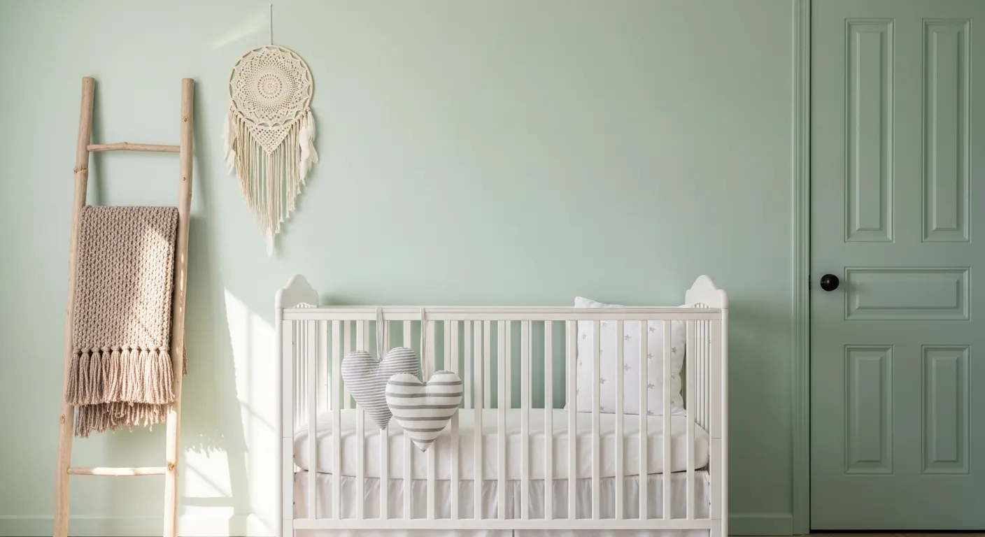
The fusion of mint green with yellow colour will bring a refreshing vibe to the interiors when paired with a chair rail. Use a yellow floral-patterned wallpaper above the chair rail and pair it with mint green paint below to create visual interest and a visually appealing look. The soothing tone of mint and yellow floral print will help create a lively pattern, especially in nurseries, to attract little kids. Since it is a gender-neutral pair of colours, it can easily look good in a girl’s as well as a boy’s room. The soothing tone of mint and yellow floral print will help create a lively pattern, especially in nurseries, to attract little kids. Since it is a gender-neutral pair of colors, it can easily look good in a girl’s as well as a boy’s room. These shades can also provide inspiration when choosing gender neutral nursery paint colors for a cheerful and welcoming space.
White and Forest Green

White and forest green shades are popular for providing a relaxing and calming effect when paired together. Homeowners evenly divide beadboard walls with a chair rail to create two tone walls by painting white above and deep green below. This brings a balanced and fresh look and adds dimensions without creating a mess. When selecting the finish for each color, it is also helpful to understand the difference between satin and semi gloss paint, as the right sheen can affect how the colors appear under different lighting conditions. It is an ideal pair for guest rooms as white and green make an inviting atmosphere. This two-tone pair enriches architectural structure and creates space with depth across the entire room.
White and Brown

Highlight the chair rail detail on stairs by using a blend of white and brown shades to create a warm and natural appeal. Paint the chair rail and lower wall panels in a brown shade to create an earthy contrast and pair it with the soothing white walls above. Paint the chair rail and lower wall panels in a brown shade to create an earthy contrast and pair it with the soothing white walls above. Before starting the project, homeowners may also want to know do you paint trim or walls first to achieve cleaner edges and a more professional finish. This colour and style theme will connect the floor with the wall design to create visual continuity.
Beige and Peach

Beige and peach are the perfect color combination for bringing warmth to the room and radiating architectural detail through the chair rail. Use peach tone on the lower portion of the wall for a vibrant look and beige, off white, or white in the upper section for a perfect balance of brightness without overwhelming the space. This pair of shades ensures cohesiveness and elegance in the room. The chair rail will serve as a divider and enhance the overall proportion and structure of the walls.
White and Sage Green

White and sage green is a versatile two-tone combo that can look youthful as well as mature in interiors. Paint the lower portion of the wall with sage green and the upper portion with white shade to create a warm and spacious interior when used with a chair rail. This combination offers flexibility to add decorative elements and accessories in the room to reflect your personal style while keeping the space aesthetically appealing.
Sky Blue and Pale Blue

Use sky blue and pale blue tones on the wall with the chair rail painted the same color for a cohesive coastal look. The contrast between the lighter and slightly deeper shades of blue is what makes this pair trendy due to its visually calm appearance. The white chair rail may separate the hues into two different parts, but it also enhances the character of the interiors.
White and Greige

The white and greige shade refines the neutrality of the dining or living area and adds a touch of charm when paired with a chair rail. Use the soft greige shade for painting the lower half of the wall and white for the other half to create a sophisticated look in the room. You can also use textured fabrics and coordinate furniture to complement the walls and enhance the entire space and light of the room.
White and Pink

The combination of white and pink shades can be used to create an aesthetic wall when paired with the same trim color on the chair rail. Place the chair rail higher than usual and paint the upper part with a pink shade to create an illusion of a low ceiling, a placement that can work especially well with tall ceilings. Paint the rest of the wall with a white shade to ensure brightness in the room. The chair rail creates an illusion of proportion and height, making the entire space look uniquely appealing.
Grey and White

The pair of grey and white are one of the most versatile two colors, as it can be used in traditional as well as modern interior setups. Painting the upper half of the wall ensures openness and light in the room, whereas painting the lower section of the room with a grey shade ensures a subtle contrast. Many interior designers also prefer using a single shade for painting everything from floor to ceiling and another shade on the chair rail to create a subtle division in most homes where a softer break is preferred.
White and Black

The shades of white and black are among the most timeless paint ideas, creating a dramatic and bold interior. The pattern of black and white striped wallpaper exudes richness and brings character to the room. When paired with a chair rail in either white or black, the room looks elegant due to the monochrome effect. This is one of the best ways of transforming a boring wall into a creative one.
Teal and White

The colour scheme of teal and white creates a distinctive look when paired with the teal blue chair rail, also called a dado rail. Designers use the unique approach of painting the lowermost section of the wall and the top portion with teal blue, while the middle section is finished in plain white or wallpaper in a white shade. It is considered one of the most classic and refreshing combinations of colours.
Choose Your Colour Combination Smartly
There are endless options from calm light shades to dramatic bold shades; you can choose shades that make the process more fun and make the space feel uniquely yours. There are endless options from calm light shades to dramatic bold shades; you can choose to paint the walls and make the space feel uniquely yours. The same principle can be applied beyond interior walls, with techniques for adding character to a plain house exterior helping create a more cohesive look throughout the property. Before committing to a full-home color change, it is also worth considering how much does it cost to paint a house, as the size of the property, paint type, labor, and number of coats can affect the overall budget. Hence, make sure to explore every possible option to finally choose your ideal colour combo based on your personal tastes that sets you in a positive mood whenever you enter that space.